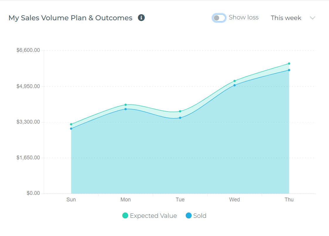
Sales Volume Planning charts track how accurately your prospects convert—comparing the expected premium you estimated for opportunities against the actual premium from sold policies. These widgets answer the question: "Are my deals closing at the value I expected?" Available in My Expected vs Actual Premium (Agent view) and Agency Expected vs Actual Premium (Agency-wide view).
What This Widget Shows
This is a Pipeline Conversion Trackerit measures deal quality and forecasting accuracy by comparing:
- What you predicted (Expected Premium from prospects)
- What actually happened (Actual Premium sold + opportunities Lost)
Understanding the 3 Metrics
1. Expected Premium (Blue Line)
The total expected premium value from all New Business opportunities that had significant activity that day:
- Prospects you created that day (newly added to your pipeline)
- Prospects that closed (Won) that day
- Prospects that were marked Lost that day
What it means: "On Monday, the total expected premium from all new business deals I worked on (including both wins and losses) was $19,700."
Data source: Sum of Expected Value field from SalesBoard prospects (new business pipeline) that were created, closed (Won), or marked Lost on that date.
2. Actual Premium (Teal Area)
The actual premium dollars from new policies you successfully sold and issued that day.
What it means: "On Monday, I closed new business deals worth $12,000 in actual premium."
Data source: Sum of premium from new policies (New Business transaction type) created that day.
3. Loss (Red Area - Toggle Controlled)
The expected premium value from prospects that were marked as Lost that day.
What it means: "On Monday, I lost deals worth $3,000 in expected premium."
Display: Shown as negative values below the zero line. Hidden by defaultenable with "Show loss" toggle.
How to Read the Chart
Example Week (Daily View):
Monday:
- Closed 1 deal: Expected $18,500 → Actual $16,800 (customer reduced coverage)
- Lost 1 opportunity: Expected $1,200
Chart shows: Expected $19,700 (blue), Actual $16,800 (teal), Loss -$1,200 (red, if toggled)
Friday - Overperformance:
- Closed 2 deals: Expected $21,500 → Actual $22,100 (customers bought MORE coverage!)
Chart shows: Expected $21,500 (blue), Actual $22,100 (teal)—teal area crosses ABOVE blue line—deals closed for MORE than expected!
Thursday:
- Closed 2 deals: Expected $18,800 → Actual $17,900 (lower coverage than estimated)
- Lost 1 deal: Expected $1,650
Chart shows: Expected $20,450 (blue), Actual $17,900 (teal), Loss -$1,650 (red, if toggled)
Agent vs Agency Views
My Expected vs Actual Premium (Agent View)
- Shows: Only YOUR personal sales activity prospects you created and policies you wrote
- Who uses it: Individual agents tracking their own conversion accuracy
- Use case: "Am I estimating deal values accurately? Are my prospects closing at expected premium?"
Agency Expected vs Actual Premium (Agency View)
- Shows: Aggregate sales activity across ALL agents in the agency
- Who uses it: Agency owners, managers, users with agency-level permissions
- Use case: "Is the team estimating deal values accurately? Where do we need training?"
Using the Widget Controls
Period Selector (Dropdown)
Choose your time range (defaults to "This Week"):
- This Week: Daily data points (Mon-Sun)
- This Month: Weekly data points (W1, W2, W3, W4)
- This Quarter: Monthly data points
- This Year: Quarterly data points
- Year to Date: Monthly data from January to current month
- Last Year: Quarterly data from previous year
Show Loss Toggle
The switch in the upper-right controls whether the Loss metric (red area) is visible:
- OFF (default): Shows Expected (blue) and Actual (teal) onlyfocus on successful conversions
- ON: Adds Loss (red) below zero linesee complete picture of where expected value went
When to enable: When analyzing conversion rates, coaching sessions, or investigating why actual < expected
Common Use Cases
1. Measure Forecasting Accuracy
Question: "How good am I at estimating deal values?"
How to use:
- Compare Actual Premium (teal) to Expected Premium (blue)
- Lines close together: Accurate forecastingyou estimate well
- Actual consistently below Expected: You're over-estimatingadjust expectations lower
- Actual above Expected (W3 in example): Customers buying MORE than predictedupselling opportunities!
2. Calculate Conversion Rate
Question: "What percentage of expected value actually converts?"
How to use:
- Enable "Show loss" toggle
- Formula: Conversion Rate = Actual Expected
- Example: Expected $15,500, Actual $16,800 = 108% (overperformance!)
- Benchmarks:
- Above 100%: Customers buying more than estimated (excellent upselling)
- 85-100%: Strong conversionminor premium adjustments
- 70-85%: Typicalsome prospects downgrade coverage
- Below 70%: Investigatepricing issues or poor qualification
3. Identify Loss Patterns
Question: "When am I losing deals, and how much?"
How to use:
- Enable "Show loss" toggle
- Look for red spikesdays with high losses
- Go to SalesBoard and filter Lost prospects from those dates
- Review loss reasons: price objections, competitor wins, no response, etc.
- Adjust strategy: better qualification, competitive pricing, follow-up cadence
4. Track Deal Quality Over Time
Question: "Are the deals I'm closing getting better or worse?"
How to use:
- Select "This Quarter" or "This Year" for long-term view
- Actual growing faster than Expected: Deal quality improving (upselling working)
- Expected growing, Actual flat: More activity but not closing (conversion problem)
- Both declining: Need more prospecting or market conditions changing
Interpreting Chart Patterns
Healthy Performance Indicators
- Teal area near or above blue line: Deals closing at expected value (good forecasting)
- Teal crosses above blue (W3 example): Customers buying MORE than expected (excellent upselling)
- Small red areas (when toggled): Low loss ratemost prospects converting
- Consistent conversion ratio: Predictable sales performance
Warning Signs
- Large gap (Actual far below Expected): Over-estimating deals or poor conversion
- Large red areas: High loss rateneed better qualification or competitive strategy
- Actual + Loss < Expected: Some deals still pending (not won or lost yet)follow up!
- Both lines declining: Less sales activityneed more prospecting
Best Practices
- Set realistic Expected Values: Enter conservative estimates in SalesBoardover-promising creates false conversion rates
- Update Lost prospects immediately: Mark losses in SalesBoard promptly so data reflects reality
- Review weekly: Check "This Week" view every Friday to spot conversion trends early
- Compare with commission charts: Use alongside "My Commission Pipeline & Tracking" to understand income impact
- Learn from overperformance: When Actual > Expected (W3), analyze what made customers buy morereplicate that approach
- Track seasonal patterns: Use "Last Year" view to identify when conversion rates improve (plan marketing accordingly)
- Coach with data: Managers can use Agency view to identify agents needing sales training (low conversion) or recognition (high conversion)
Troubleshooting
Chart shows no data
- Cause: No sales activity during selected period
- Solution: Change period to longer timeframe (e.g., "This Quarter")
- Verify: Check SalesBoard for prospects created/closed in selected dates
Expected values seem wrong
- Cause: Incorrect Expected Value amounts in SalesBoard prospects
- Solution: Review and update Expected Value field in SalesBoard to reflect realistic estimates
- Note: Widget uses Expected Value from when prospect was created/closed/lost
Actual doesn't match policies written
- Cause: Policy premium amounts not recorded correctly
- Solution: Verify policies have premium amount and issue date filled in
- Check: Ensure policy creation workflow captures premium correctly
Loss toggle shows nothing
- Cause: No prospects marked Lost during selected period
- Solution: This is normal if you haven't lost any dealsgreat news!
- Verify: Check SalesBoard for prospects with Lost status in selected dates
Key Takeaways
- This widget measures deal conversion accuracy, not monthly goals
- Expected Premium = value of opportunities you worked on each day
- Actual Premium = value of policies you actually sold
- When Actual > Expected (like W3): customers buying MORE than predictedanalyze why and replicate
- Use "Show loss" toggle to see where expected value went: sold, lost, or still pending
- Review weekly to catch conversion trends early and adjust strategy