Sales Volume Charts provide visual trend analysis of your sales activity over time, helping you identify patterns, track growth, and compare new business acquisition against renewal performance. These charts are available in two perspectives: My Sales (Agent view) and Agency Sales (Agency-wide view).
Agent vs Agency Perspectives
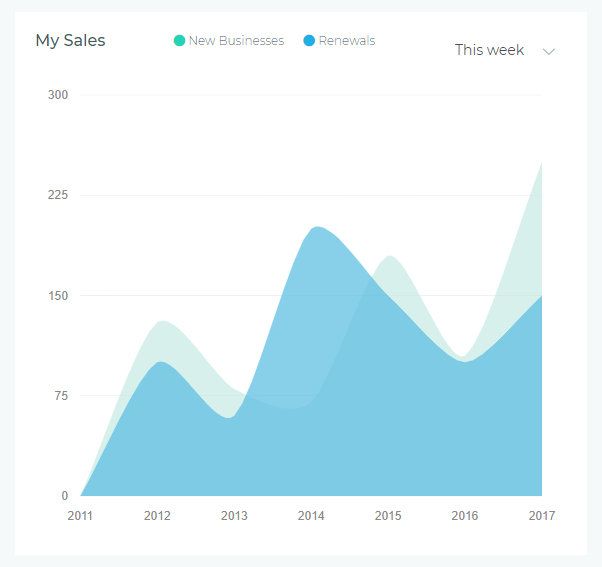
My Sales Chart (Agent View)
Displays only your personal sales activity—policies you created, renewed, or were assigned to you as the servicing agent.
- Who sees it: Individual agents tracking their own performance
- What it shows: Your new business count and renewal count over the selected period
- Use case: Personal goal tracking, identifying your peak sales periods, monitoring your renewal rate
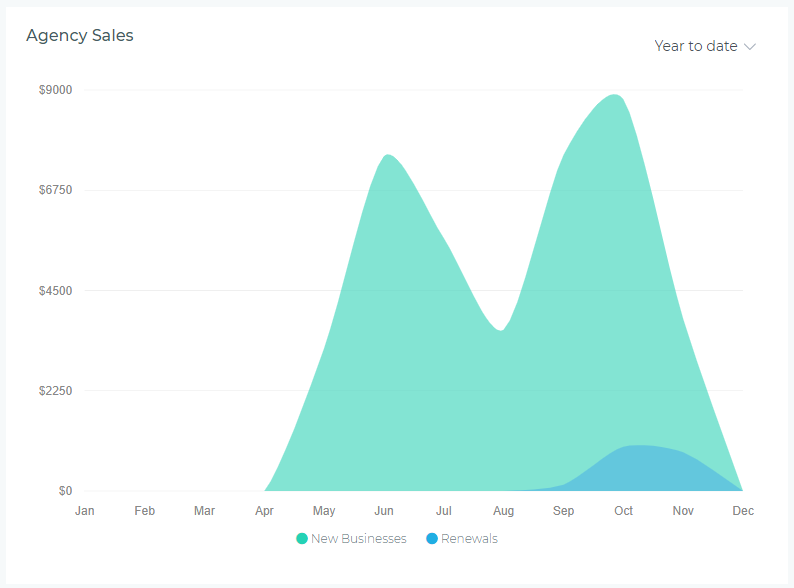
Agency Sales Chart (Agency View)
Displays aggregate sales activity across all agents in the agency—total new businesses and renewals for the entire team.
- Who sees it: Agency owners, managers, and users with agency-level permissions
- What it shows: Total agency new business count and renewal count over the selected period
- Use case: Team performance analysis, capacity planning, identifying agency-wide trends
Understanding the Chart
Visual Elements
- Green Area: New Businesses count (policies created for first-time customers or new products)
- Blue Area: Renewals count (existing policies renewed during the period)
- X-Axis: Time intervals based on selected period (days, weeks, months, quarters)
- Y-Axis: Policy count (number of policies written)
Reading the Data
The chart uses stacked areas, meaning:
- The green area shows new business volume at the bottom
- The blue area stacks on top, showing renewals volume
- The total height at any point represents combined sales activity (new + renewals)
- Peaks indicate high-activity periods; valleys show slower sales periods
Period Selector
The dropdown in the upper-right corner lets you adjust the time range displayed:
- This Week: Daily data points for the current week (Monday-Sunday)
- This Month: Daily data points for the current calendar month
- This Quarter: Weekly data points for the current quarter (Q1, Q2, Q3, Q4)
- This Year: Monthly data points for the current calendar year (January-December)
- Year to Date: Monthly data from January 1st through today
- Last Year: Monthly data for the previous calendar year
Data updates dynamically when you change the period—no page refresh required.
Common Use Cases
Tracking Personal Sales Goals (Agents)
Use "This Month" view to:
- Monitor progress toward monthly sales targets
- Compare new business acquisition vs. renewal retention
- Identify days when you were most productive (peak sales days)
- Adjust effort allocation between prospecting (new business) and servicing (renewals)
Identifying Seasonal Patterns
Use "This Year" or "Last Year" view to:
- Spot recurring seasonal trends (e.g., higher sales in January, lower in summer)
- Plan marketing campaigns around high-activity months
- Anticipate slow periods and proactively generate leads
- Compare year-over-year growth by overlaying current year vs. last year mentally
Measuring Retention Rate
Renewals vs. new businesses ratio indicates customer retention health:
- High Blue (Renewals): Strong retention—existing customers are renewing consistently
- High Green (New Business): Growth phase—acquiring many new customers
- Balanced Mix: Healthy business—sustaining existing book while growing
- Low Blue, High Green: Warning sign—acquiring customers but not retaining them
Team Capacity Planning (Managers)
Use Agency Sales Chart with "This Quarter" to:
- Determine if the team can handle projected sales volume
- Identify weeks requiring additional support or staffing
- Balance workload across agents during peak periods
- Forecast future staffing needs based on growth trends
Interpreting Patterns
Healthy Sales Patterns
- Steady Upward Trend: Both new business and renewals increasing over time—indicates business growth
- Consistent Renewal Volume: Blue area remains stable or grows—shows strong retention
- Predictable Peaks: Regular high-activity periods aligned with marketing campaigns or seasonal trends
- Balanced Mix: Green and blue areas roughly proportional—sustainable growth model
Warning Signs
- Declining Renewals (Blue Shrinking): Retention problems—customers not renewing, potential service issues
- Flat New Business (Green Plateauing): Lead generation problems or market saturation
- Erratic Spikes: Inconsistent sales activity—may indicate workflow inefficiencies or irregular effort
- Total Volume Dropping: Combined sales declining—requires immediate action and root cause analysis
Tips for Maximizing Value
- Check Weekly: Review "This Week" view every Monday to plan your week and set daily targets
- Compare Periods: Switch between "This Month" and same period last year to measure growth
- Export Data for Reporting: Screenshot the chart for performance reviews, team meetings, or presentations
- Correlate with Marketing: Overlay marketing campaign dates mentally to measure campaign effectiveness
- Set Alerts: If your chart shows declining trends two weeks in a row, investigate immediately
- Use with Totals Row: View Sales Charts alongside Performance Metrics Cards for complete picture (visual trend + numeric KPIs)
Troubleshooting
Chart Shows No Data
- Check Period Selection: Ensure you're viewing a period during which you had sales activity
- Verify Permissions: Agency Sales Chart requires agency-level permissions—contact administrator if needed
- Recent Data: Very recent policies (today) may take a few minutes to appear—refresh if needed
Numbers Don't Match Reports
- Policy Status: Chart counts issued policies; reports may include quotes or pending policies
- Date Range: Ensure chart period matches report date range exactly
- Agent Assignment: My Sales counts policies assigned to you; reports may use different ownership logic
Chart Loads Slowly
- Large Period: "Last Year" or "Year to Date" with high volume takes longer—be patient
- Network Speed: Chart data loads from server—slow connection affects load time
- Browser Cache: Clear browser cache if chart consistently fails to load
Best Practices
- Daily Check (Agents): Glance at "This Week" view each morning to stay aware of your pace
- Monthly Review: End-of-month review using "This Month" to assess goal achievement
- Quarterly Analysis: Use "This Quarter" to spot trends and plan next quarter strategy
- Year-Over-Year Comparison: Compare "This Year" vs "Last Year" annually to measure growth
- Team Meetings: Managers should display Agency Sales Chart during team meetings to visualize collective progress
- Retention Focus: If blue area is shrinking, prioritize customer retention efforts over new business acquisition
Next Steps
Sales Volume Charts work best when combined with other dashboard widgets for comprehensive performance insights. Consider adding:
- Performance Metrics Cards: See exact numeric counts alongside visual trends
- Commission Charts: Understand revenue impact of sales volume changes
- Customer Growth Chart: Correlate sales activity with customer base growth