What is the Dashboard?
The Dashboard is your command center in Taino—a customizable view of the metrics that matter most to you and your team. Unlike detailed reports that provide historical analysis, the Dashboard delivers at-a-glance insights through interactive widgets that display your key performance data.
Whether you're an agent tracking your personal performance or a manager monitoring team metrics, the Dashboard provides instant visibility into key performance indicators (KPIs) without the need to navigate through multiple screens or run complex reports. With over 15 specialized widgets for sales, commissions, pipeline tracking, and team performance, you can build a customized view that matches your workflow.
Dashboard vs. Reports: Understanding the Difference
While both Dashboards and Reports help you understand your business, they serve distinct purposes:
| Feature | Dashboard | Reports |
|---|---|---|
| Purpose | Daily performance monitoring and quick insights | Detailed historical analysis and decision-making |
| Data | Aggregated daily metrics (updated nightly) | Historical data with filters and date ranges |
| Format | Visual widgets: charts, meters, KPI cards | Tabular data with export options (PDF, Excel) |
| Interaction | Quick period selectors, toggles, tooltips | Advanced filters, sorting, grouping, drill-downs |
| Use Case | Daily performance tracking, pipeline monitoring | Accounting reconciliation, compliance audits, trend analysis |
| Count | 15 dashboard widgets available | 30+ comprehensive reports available |
How to Access the Dashboard
The Dashboard is your default landing page when you log in to Taino. You can also navigate to it at any time:
- Click the Dashboard icon (home icon) in the top navigation menu
- Or, click your Profile icon → Select Dashboard
Types of Dashboard Widgets Available
Taino offers 15 different dashboard widgets organized by functionality:
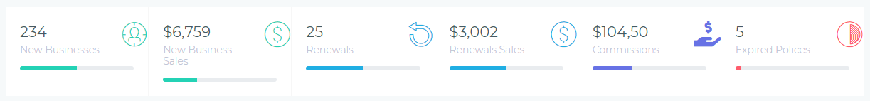
Performance Metrics (KPI Cards)
Display key metrics at-a-glance, including new business count, renewals, commissions earned, and payments collected. Available for both agent and agency perspectives.
Sales Tracking Charts
Visualize sales volume over time with separate tracking for new business vs. renewals. Monitor trends and identify peak performance periods for agents or the entire agency.
Commission Tracking Charts
Track commission earnings over time to monitor income trends and compensation patterns. View agent-level or agency-wide commission performance.
Revenue Analysis
(Agency-level only) Comprehensive revenue breakdown showing income sources, trends, and financial performance across the entire agency.
Team Performance Leaderboards
Rank agents by commission earnings or policy count to recognize top performers, encourage healthy competition, and identify training opportunities.
Customer Growth Tracking
(Agency-level only) Monitor customer acquisition trends and track how your customer base grows over time for strategic planning purposes.
Productivity Tracking
(Agent-level only) Track work hours with the Worked Hours Meter to monitor productivity and billable time.
Agent-Level vs. Agency-Level Insights
Dashboard widgets are designed to serve different roles within your organization:
- Agent-Level Widgets: Focus on individual performance. Agents see their own sales, commissions, tasks, and personal metrics. These widgets help agents track progress toward personal goals and manage their daily workflow.
- Agency-Level Widgets: Provide a bird's-eye view of team performance. Managers and administrators see aggregated metrics across all agents, revenue analysis, customer growth, and team leaderboards. These widgets support strategic decision-making and team management.
Interacting with Dashboard Widgets
Most dashboard widgets offer interactive features to help you explore your data:
Period Selectors
Change the time frame for your data using dropdown selectors. Common options include:
- This Week – Current week's data (Sunday to Saturday)
- This Month – Current calendar month
- This Quarter – Current fiscal quarter
- Year to Date (YTD) – January 1st through today
- Last 30 Days – Rolling 30-day window
Toggle Options
Some widgets include toggle switches to show or hide additional data. For example, the commission and premium pipeline widgets include a Show Loss toggle to display lost opportunities in red.
Tooltips and Data Points
Hover your mouse over chart elements (bars, lines, data points) to see detailed information including exact values, dates, and breakdowns.
Color Coding
Widgets use consistent color schemes to help you quickly interpret data:
- Green – Expected/projected values, new business, positive trends
- Orange – Pending items awaiting action or approval
- Blue – Posted/confirmed items, renewals, sold premiums
- Red – Losses, lost opportunities, negative trends
Understanding Data Updates
Dashboard metrics are calculated and updated nightly by automated jobs that process all the day's activity. This means:
- Today's activities (new policies, commissions, customers) will appear on the Dashboard tomorrow morning
- The Dashboard always shows data through yesterday (end of day)
- Historical trends and charts reflect completed days for accurate analysis
- Commission pipelines show the latest status from yesterday's processing
Benefits of Using the Dashboard
The Dashboard provides several advantages for managing your insurance operations:
- Instant Visibility: See your most important metrics without navigating through multiple screens or running reports
- Performance Monitoring: Track progress toward goals in real-time and identify trends early
- Pipeline Management: Monitor commission workflow and sales opportunities to forecast cash flow and identify bottlenecks
- Team Motivation: Leaderboards and performance metrics encourage healthy competition and recognize top performers
- Data-Driven Decisions: Make informed decisions based on current data rather than gut feelings or outdated information
- Customizable Views: Each user can configure their Dashboard to show the widgets most relevant to their role and responsibilities
- Mobile-Friendly: Access your Dashboard from any device to check performance on-the-go
Getting Started with Your Dashboard
Ready to optimize your Dashboard experience? Here's what to do next:
- Review Available Widgets: Explore the articles below to learn what each widget displays and how to interpret the data
- Customize Your Layout: Add, remove, or rearrange widgets to match your workflow (see Customizing Your Dashboard)
- Set Your Preferences: Configure period selectors and toggle options to match your reporting needs
- Check Daily: Make the Dashboard part of your morning routine to stay on top of performance metrics
- Share Insights: Use Dashboard data in team meetings to discuss performance, set goals, and celebrate wins
Need Help?
If you have questions about the Dashboard or need assistance with widgets, look for the Newton AI magic button (purple sparkle icon) in the bottom-right corner. Newton can help you understand your Dashboard data, configure widgets, and answer questions about your metrics in real-time.