What Is the Newton Data Agent?
The Newton Data Agent is a conversational way to query your agency's data. Customers, policies, commissions, renewals, production, and more. Without building a report from scratch. You ask a question in plain language and Newton returns the answer as an interactive table or chart directly inside the chat panel.
What makes the Data Agent especially powerful is the ability to keep a query. Any result you find useful can be saved as a named custom report. It is added to your personal reports library, ready to re-run anytime with fresh data. No need to ask the same question again.
How to Switch to Data Agent Mode
When you open Newton. By clicking the Newton icon in the bottom-right corner of any page. The panel opens in Support Agent mode by default. To switch:
- Open the Newton panel by clicking the Newton icon (bottom-right, visible on every page)
- At the top of the Newton panel, locate the mode selector
- Click Data Agent to switch modes
- The chat area updates. You will see a prompt indicating Newton is ready to answer data questions
Newton remembers which mode you were in during your session, so you do not have to switch every time you open the panel.
Asking Good Data Questions
You do not need to know SQL or any technical language. Just ask naturally. The more specific you are, the more focused the result will be. Here are some comparisons to help you get the most out of Newton:
| Vague | More Specific (Better) |
|---|---|
| "Show me commissions" | "Show me total commissions by carrier for the current year, sorted highest to lowest" |
| "What policies are expiring?" | "List all policies expiring in the next 30 days with the customer name and carrier" |
| "How are we doing?" | "Compare new business vs renewal revenue by month for this year" |
| "Show customers" | "List customers who have only one policy. My cross-sell opportunities" |
More Example Questions
- "Which agents closed the most new business last quarter?"
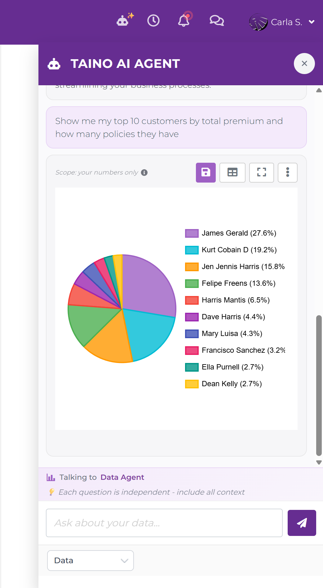
- "Show me my top 10 customers by total premium."
- "What percentage of my policies are auto vs home vs life?"
- "Show me customers who have not been contacted in the last 90 days."
- "How many new prospects were added each month this year?"
- "What is the retention rate for policies renewed this year?"
Parameterized Queries: Ask Newton to Build Your Filters
Some questions naturally involve multiple filter dimensions. A date range, a policy type, an agent, a carrier. Instead of a plain result, Newton returns a Parameterized Query card with all those filters pre-built and ready to fill in.
For example, asking: "List customer name and policy number with total premium, for a given date range, filtered by policy type, policy status, agent, and carrier" produces a card like this:
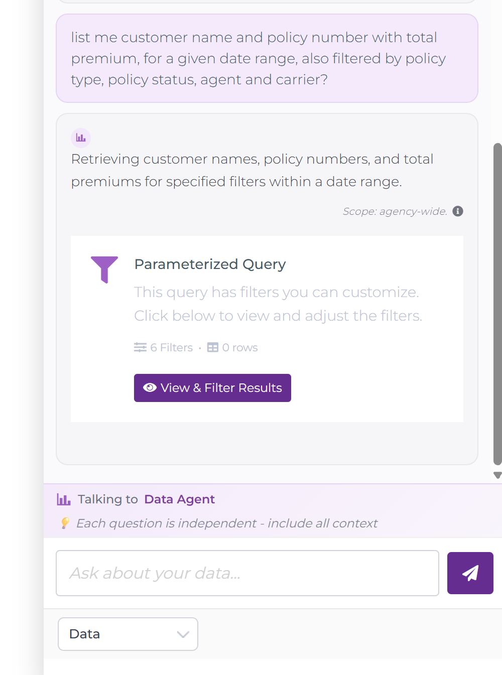
The card tells you how many filters were detected and how many rows are ready to load. Click View & Filter Results to open the full-screen results modal:
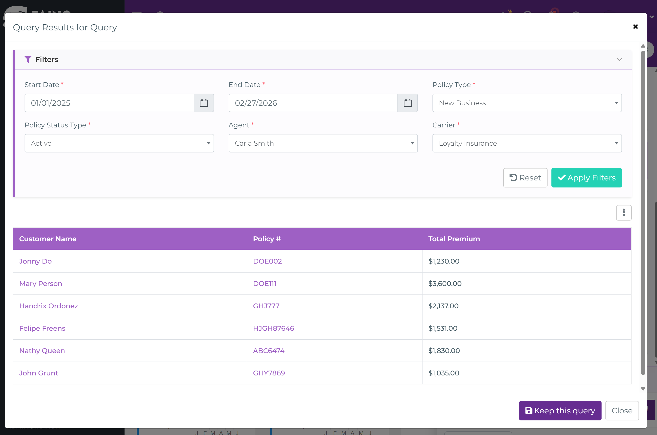
From here you fill in the filter values. Start date, end date, policy type, status, agent, carrier. Then click Apply Filters to load your results. The table updates instantly. You can switch to chart view, maximize, export to CSV, or save the whole thing as a named query in Analytics Hub.
Newton returns results as an interactive result card inside the chat. Results can appear as a table or a chart, and you can switch between both views at any time.
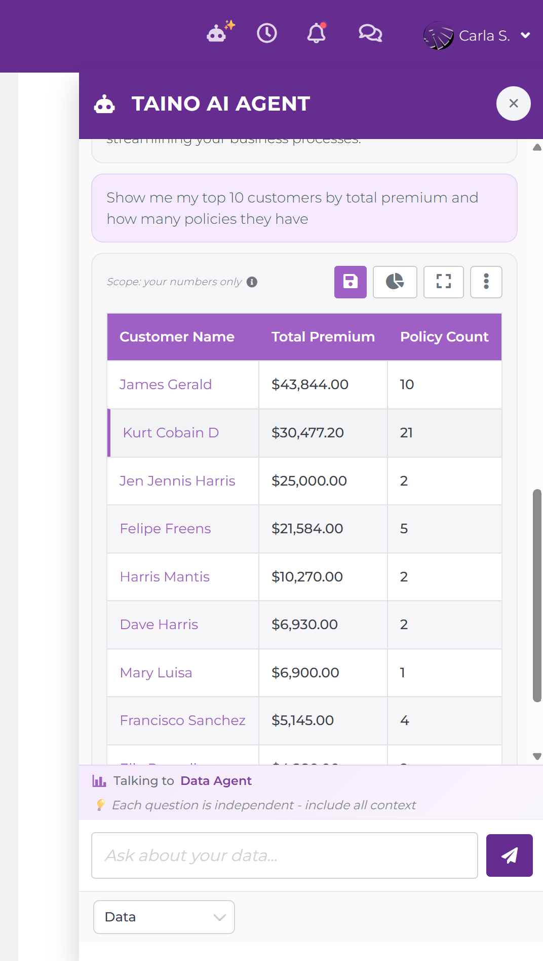
The Scope Label
At the top-left of every result card you will see a Scope: your numbers only label with an info icon. This confirms that Newton is working exclusively with your agency's data. No external data, no other agencies. Click the info icon if you want a reminder of what that means.
The Result Card Toolbar
The four buttons in the top-right corner of every result card give you full control over what to do with the result:
- Save (floppy disk icon): Keeps this query as a custom report in your personal reports library. See Keeping a Query below for the full walkthrough
- Chart toggle (pie chart icon): Switches the result between table view and chart view. Newton picks a default chart type based on your data, but you can change it. Either by switching here and then saving with a different chart type, or by asking Newton directly: "Show this as a bar chart" or "Give me a line chart instead"
- Expand (square icon): Opens the result in a full-screen overlay for a larger, easier-to-read view. Press Esc or click outside to close
- More options (three dots): Expands a menu with three additional actions. Print the result, Export to CSV to download the data as a spreadsheet, or Copy to Clipboard to paste the data elsewhere
Filtering Results
Use the filter controls on the result card to narrow down what you see without asking a new question:
- Date range: Adjust the time window to zoom in on a specific period
- Dimensions: Filter by agent, office, carrier, policy type, or other categories depending on the data returned
Filters are applied on top of the current result. To change the underlying question, simply type a new message in the chat.
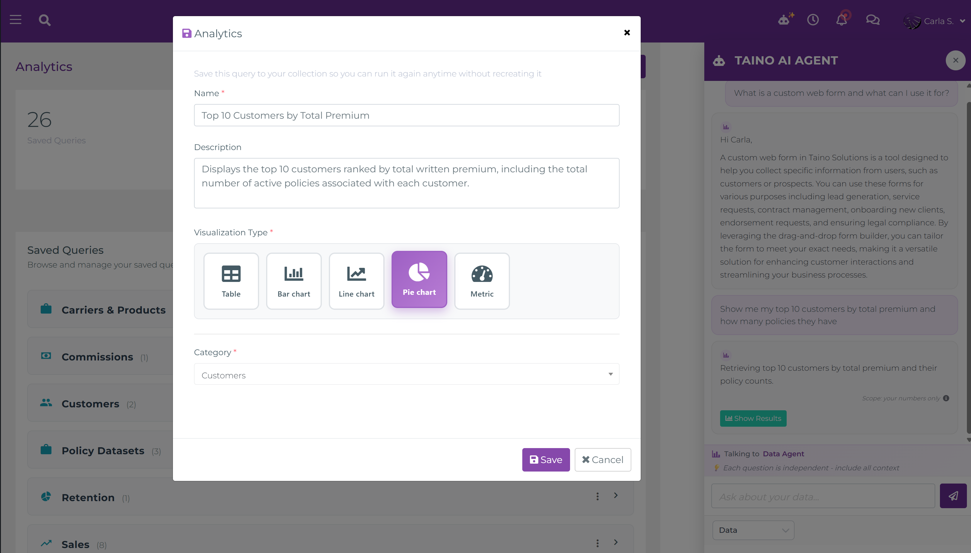
Keeping a Query: Saving as a Custom Report
When Newton returns a result that you will want to come back to. Like a monthly commissions breakdown or your renewal pipeline. You can save it as a custom report with one click. This is called keeping a query.
How to Keep a Query
- After Newton returns a result you want to save, click the Save (floppy disk) button on the result card toolbar
- The Analytics save dialog opens with the following fields:
- Name *: Give your query a clear, descriptive name you will recognize later. For example, "Monthly Commissions by Carrier" or "Expiring Policies – Next 30 Days"
- Description: (Optional) Add a short note about what this query is for or how you use it
- Visualization Type *: Choose how the saved query should display by default. Table, Bar chart, Line chart, Pie chart, or Metric. Newton picks one automatically based on your data, but you can override it here. You can also ask Newton for a specific type before saving. For example: "Show this as a bar chart"
- Category *: Assign the query to a category to keep your library organized. Use the dropdown to select an existing category or type a new name to create one on the spot
- Click Save. The query is added to your Analytics library
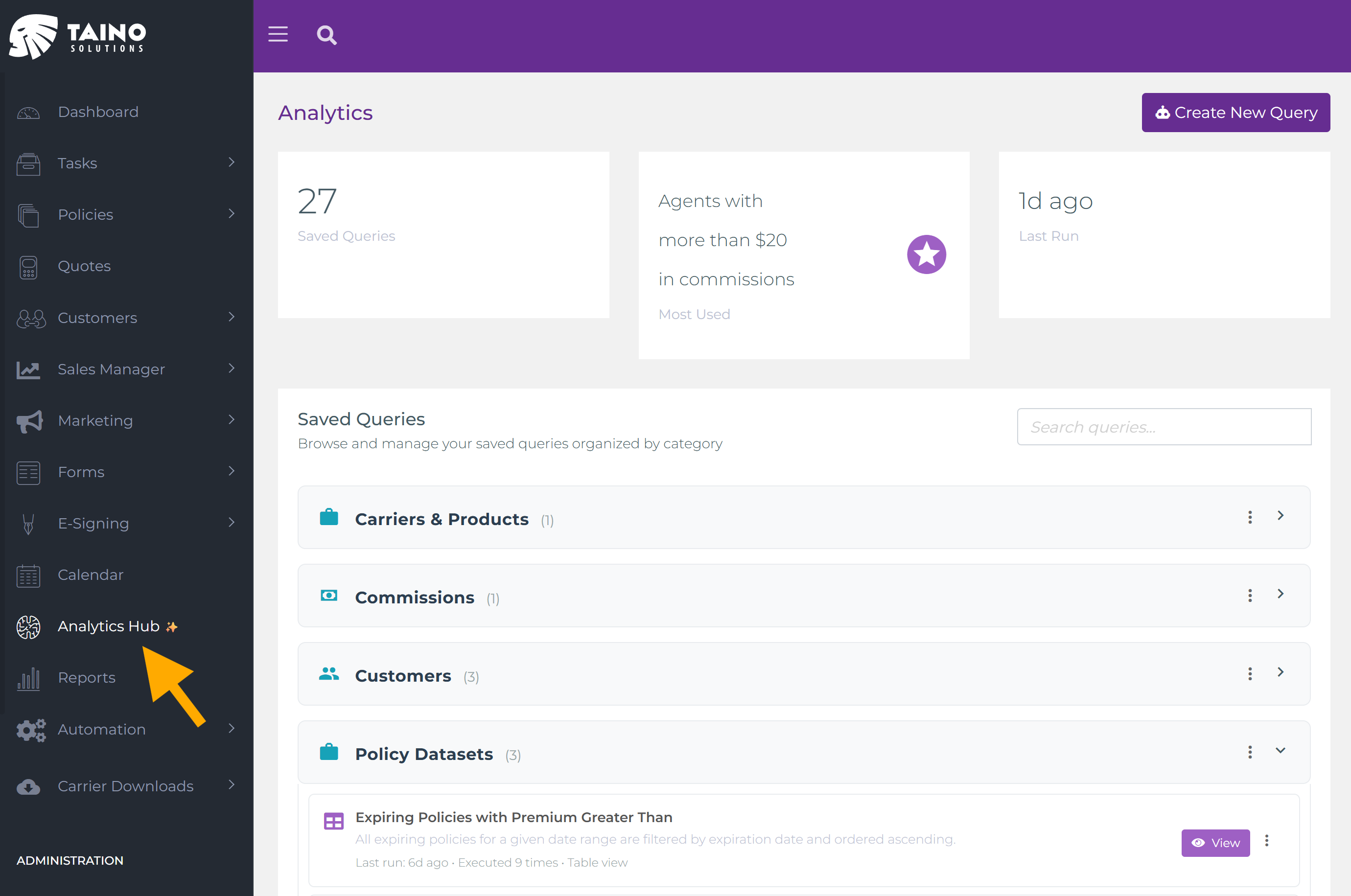
The Analytics Hub: Your Saved Queries Library
All queries you have saved live in Analytics Hub, accessible from the left navigation menu (look for the brain icon with a ✨ sparkle). At the top of the page you will see three summary cards:
- Saved Queries count: The total number of queries you have saved so far
- Most Used: The name of the query you run most often. A quick reference to your go-to report
- Last Run: How long ago you last ran any saved query
Below the summary cards is the Saved Queries section with a search bar to find queries by name. Queries are organized into the categories you assigned when saving, each showing the count of queries inside in brackets (e.g. Carriers & Products (1), Customers (2)). Expand a category to see its queries. Each one shows its description, last run time, execution count, and visualization type. From here you can:
- View a saved query: Click View on any query to execute it against current data. You always see the latest numbers
- Create a new query: Use the Create New Query button (top-right) to start a fresh query from Analytics Hub directly, without going through the Newton chat
- Manage categories: Use the category options menu (three dots) to add or remove categories
- Edit or delete a query: Use the query options menu (three dots) to update its name, description, visualization type, or category. Or delete it entirely